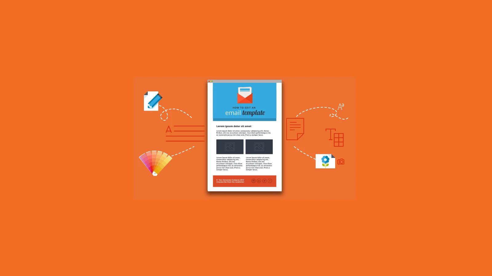

HTML email template is a pre-formatted file that employs HTML tags, as well as inline CSS, to format, brand, and make emails artistic in nature. As opposed to plain text messages, such templates can contain images, clicks buttons, responsive layouts, and tables. This is important since email is typically one of the most profitable marketing channels with research showing that every dollar spent on email marketing can yield up to 36 dollars. The problem is that not all emails look the same or differently in various cases on devices and in clients. 1.What is optimized in Gmail on the computer may not render on Outlook or may do so poorly in an iphone. This is why well-defined design guidelines should be used so that you can create emails that are professional, legible, and usable on every mobile device or email client your subscribers happen to use.
When designing an html email template, structure is everything. Mobile email opens have surpassed 41 percent (Campaign Monitor), so you need to ensure your template is responsive. A safe bet is to keep the overall width at between 600-640 pixels on desktop version with the layout fitting into one column on mobile. Catchy topics with good headings and the right use of calls-to-action make emails readily scannable and actionable. The next thing important is the readability. The fonts must be big so that reading does not strain the eye, and there should be sufficient padding on the buttons to promote ease of tapping on a touchscreen. Visual hierarchy is also important so that your main point or CTA must be close to the top and secondary points down the chain. Lastly, watch out of pictures: it is important to include alt text and never use visuals as the only means of conveying information, as most email clients block images out of the box.
Code and Compatibility Rules
Email coding does not work the same as web coding. Although all modern browsers have sophisticated CSS, email clients do not. In Microsoft products, such as Outlook, continue to use the rendering engine of its Microsoft Word, which, even today, does not support flexbox or CSS grid. This is the reason why you must use HTML email templates which are more structure-oriented by the use of tables.
Here are the vital compatibility practices
- Inline CSS only: External CSS can not be reliably used.
- Avoid javascript:Scripts are blocked by most e-mail clients due to security considerations.
- Fallbacks are important: At least have web-safe fonts (ie. Arial, Georgia, Verdana) as backup.
- Absolute URLs: Links and photographs should refer to absolute URLs instead of relative so that when a site is moved to another location, URLs are still correct.
- Check on all devices: There are special online services like Litmus or Email on Acid which will allow you to see how your e-mail looks on Gmail, Outlook, Apple Mac, and on mobile devices.
When neglected these coding rules often result in the layouts being broken, unreadable text, or some content missing all together. Solid coding habits mean that your email will once again never show holes and will always look professional wherever it is most likely received.
Content Rules for Better Engagement Across Devices
Creating a visually concrete HTML email mail template is just part of the battle content is what will actually drive traction People do not read emails word for word and therefore clarity and brevity is vital. The subject lines must be less than 50 characters long on mobile and preheader text must support and develop the message. In the body, break up the information into snatches and give the first 100 words priority as many mobile apps cut short previews.Personalization is crucial as well. Campaign Monitor points out that subject lines that are personalized are 26% more likely opened. By including the name of the recipient or personalizing the offers based on previous behavior it is possible to boost the number of responses. A call-to-action should be clear and prominent and perform best when located in the initial scroll. Lastly, mix text with pictorials, yet images should never be used exclusively in case a client blocks them and the message should remain unaltered as a result. Uniform voice, handy links, and navigable structure make your content heard all across the board.
Limits and Common Mistakes to Avoid
Even an excellent HTML email Subject Line will not be a success when some fundamental errors creep in. One of the most frequent ones is using large image sizes, which slow down the loading time besides causing layout problems in the mobile device. The other fault is overdesigning with more columns or too much CSS can fail in Outlook and Gmail. Minimizing surprises can be achieved by keeping layouts simple and predictable.Accessibility is also been overlooked by marketers. Emails that lack enough color contrast or those with no alternative text or text embedded as part of an image exclude even a majority of customers. Run a check on font size, distances between links, and intelligibility of handicapped visitors to enhance compliance as well as appointment. Another pitfall is overuse of the promotional wordings. Last, it is very expensive not to test on various devices and client systems. An email campaign that will look great in Gmail, on Chrome, may break when viewed on an Outlook application. Extensive testing will avoid embarrass humiliating failures.
Conclusion
Designing a HTML email template that displays consistently across devices is about neither chasing nor trying new trends but by adhering to designs, coding and content best practices. The easy-to-understand structure of your email, uncluttered coding with tables and CSS that is written inline, and content convenient to read even when on the move are all factors that may help deliver emails people take time out to read. When your template is not responsive, readable and consistent, you lose chances immediately. You get people to trust you, and convert better, by practicing good design techniques in terms of design limits, testing and user experience. When done properly, HTML emails will not only land in users inboxes they will be opened, read, and acted upon, regardless of how or where they are viewed.
Raghav is a talented content writer with a passion to create informative and interesting articles. With a degree in English Literature, Raghav possesses an inquisitive mind and a thirst for learning. Raghav is a fact enthusiast who loves to unearth fascinating facts from a wide range of subjects. He firmly believes that learning is a lifelong journey and he is constantly seeking opportunities to increase his knowledge and discover new facts. So make sure to check out Raghav’s work for a wonderful reading.